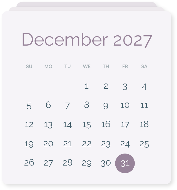
It’s now July. The year is already half gone (!) and planner fans are starting to think about planners for 2027.
You can now order your agendio with any 2027 start dates, up to December 31, 2027
If you order two agendios for each year in advance, one starting in January and the other in July, you can now order them for 2027.
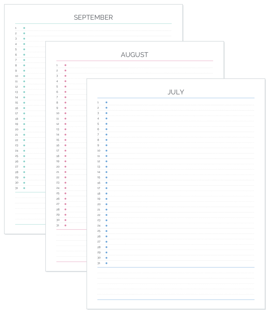
Don’t forget about our “Future month” Extra pages – They look like row monthlies. Add some after your dated pages to have a place to list appointments and todos right after your planner ends, and then copy over those tasks when you start your next planner.
Are you a teacher looking for a planner for schooldays-only?
Do you need a planner only for workdays?
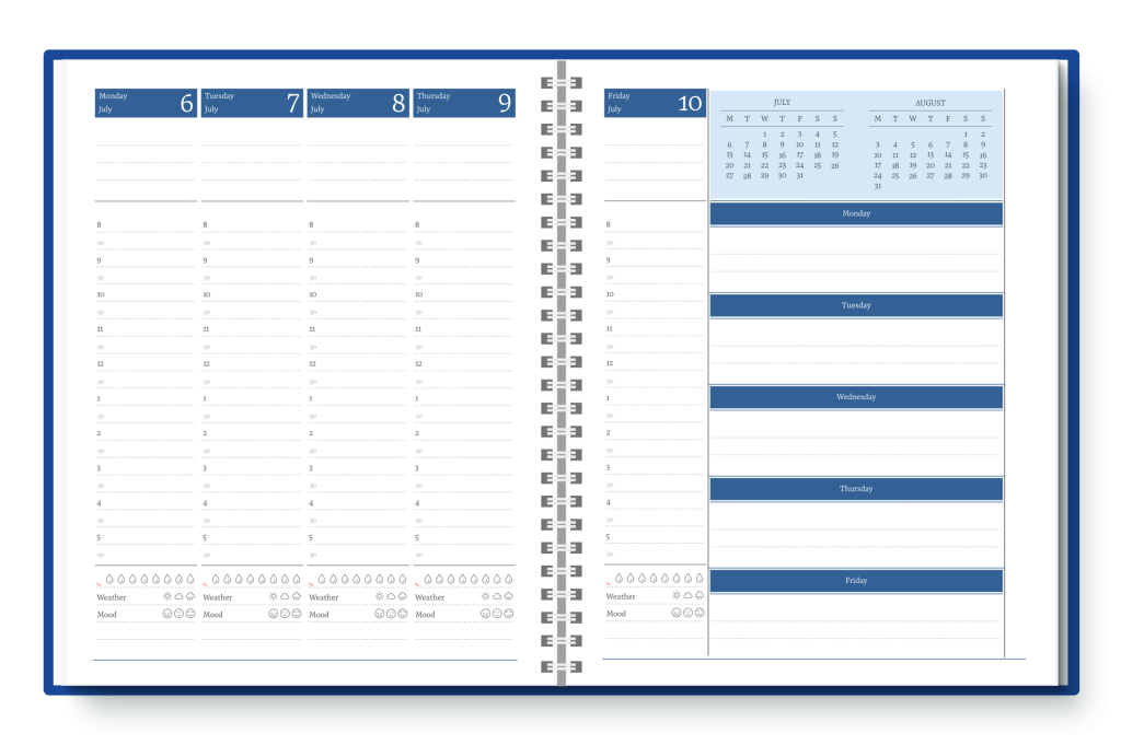
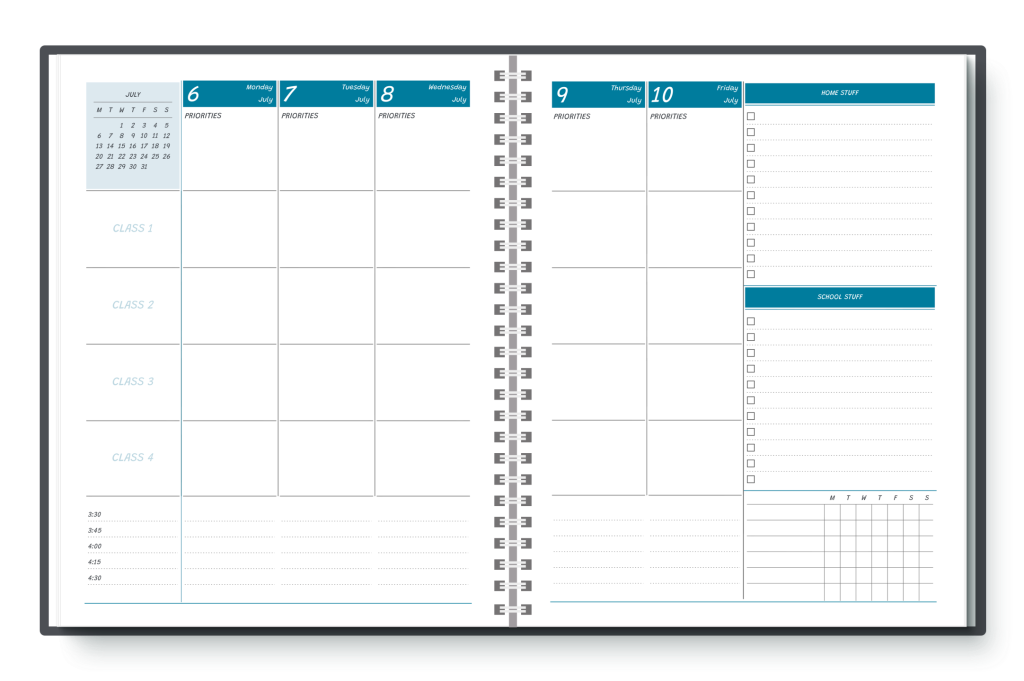
Have you been looking for weekday-only agendios?
Well you’re in luck! Agendio now offers weekday-only Pro pages for you to use to create weekday-only planners and inserts.
We offer a full variety of weekday-only planners, including column planners, such as this layout for teachers,
as well as sidebar weekday-only planners.
You can also find row weekend-only planners in a variety of layouts
and grid layouts
Whatever your weekday-only planner needs, we’re confident you will find what you need in an agendio.
To make one, go to the Agendio Hub and start a page as you would normally. When it’s time to select a template or a blank canvas, you will see the option for Full week (7 days) or Weekday-only (5 days). Select the 5-days option and go from there.
It’s been just over six weeks since we added tables and around one month since we added widgets and it’s been so much fun! We’re seeing so many of them and we’re also seeing some great new ways they’re being used, so we decided to share some more of them with you:
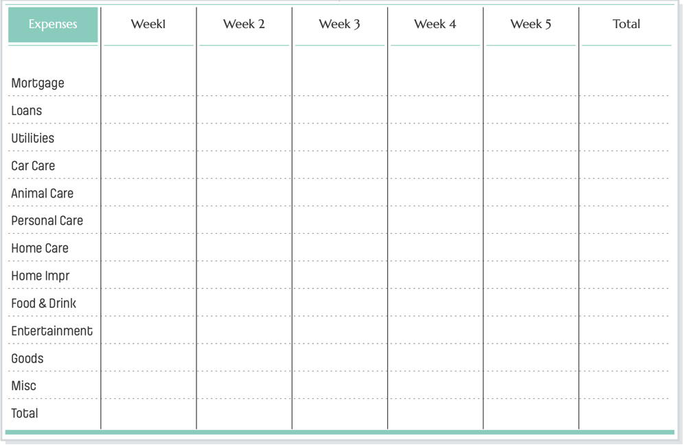
Antonia is using an Agendio table to track expenses by week. This gives her a clear picture of where her money is going, and also makes it easy to add up her expenses by week or by expense type. Very nice!
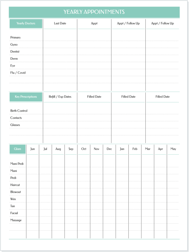
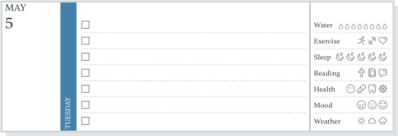
Taylor created a table to keep track of her health and well-being throughout the year:
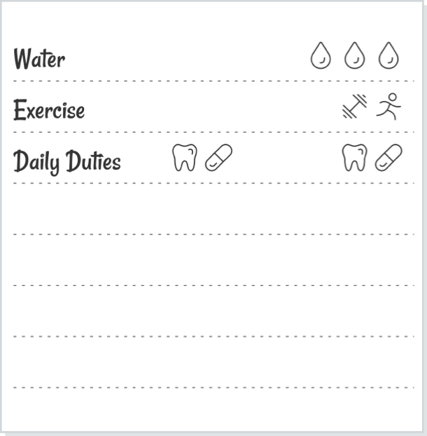
Brittney separated some of her widgets into morning and evening widgets:
Jennifer is using widgets to track a week at a time on her weekly pages…
… while Sara is doing the same thing but on her monthly pages.
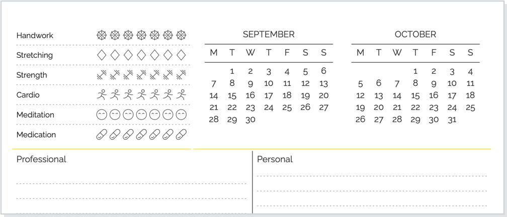
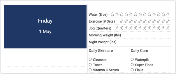
Last but not least, Alice created an exercise and fitness page with both tables and widgets on the same page.
How do you plan to include tables and widgets in your next agendio?
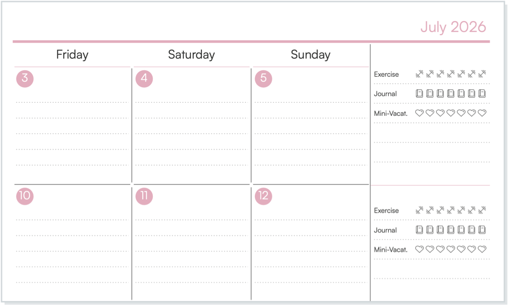
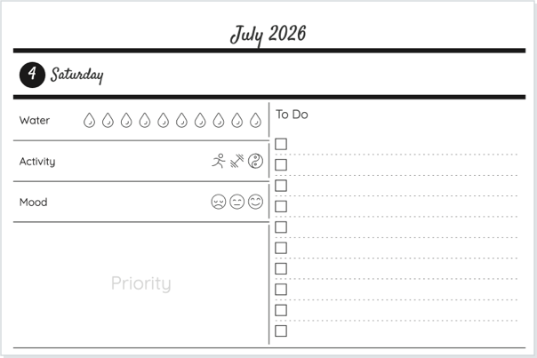
We introduced Agendio widgets a few weeks ago and now we’re seeing widgets everywhere! And the variety of ways the Agendio community is using them is amazing.
Agendio widgets are not about work todos that you can track with tables and standard trackers. They’re a concise visual way to help you manage your mind and body. The widgets represent your day-to-day needs and goals for your health, your mood, your overall spiritual and corporal well-being and how you are using time for yourself.
If you’re thinking of adding them to your next agendio and are looking for some ideas, we want to share some with you.
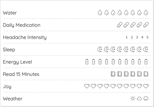
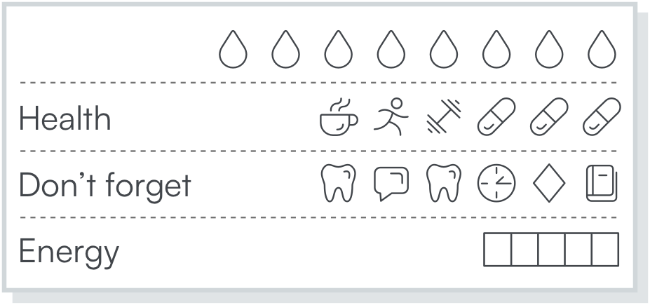
Here’s one showing some of our most popular widgets in a standard format.
There are also many other widgets and many ways to show them in your planner. Here are some images of widgets recently added to customer planners:
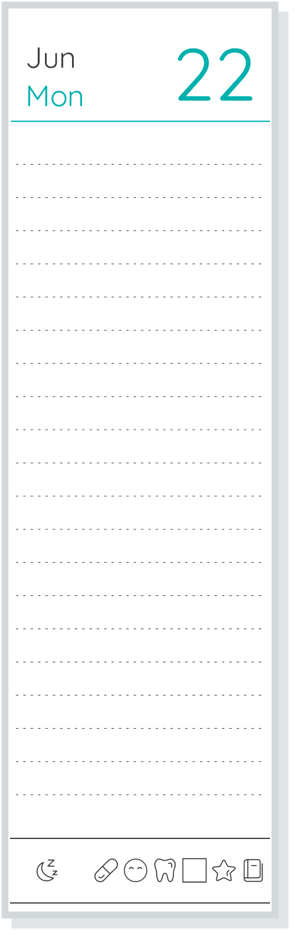
One style is to place a few key widgets in a thin discreet line at the bottom of columns:
or like this:
A different way is to show a big mix of widgets:
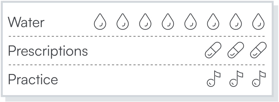
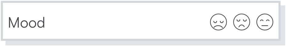
Some agendio planner fans are using widgets as they use the water widget, to to represent a total score, such as an energy level out of ten or a headache intensity out of 5 …
… or for counting exercise reps.
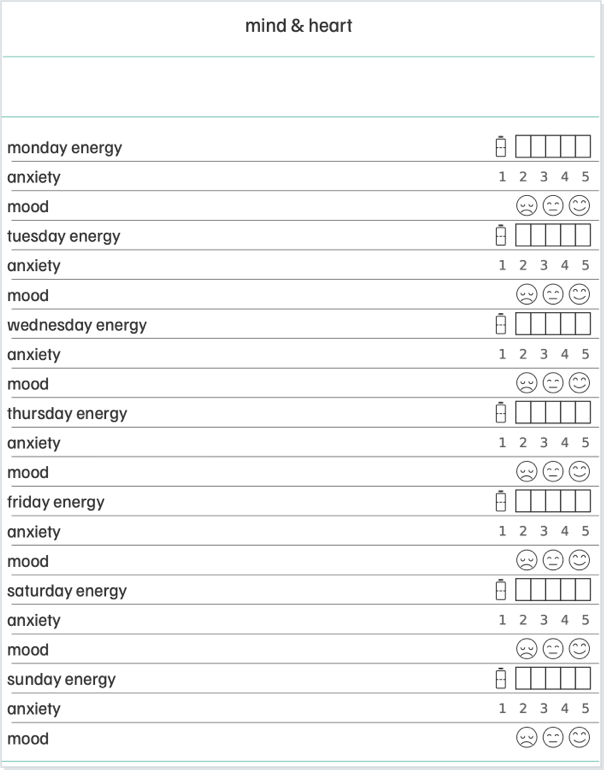
A novel way we saw is to show a week’s worth of widgets, in this case tracking mood, energy levels and anxiety:
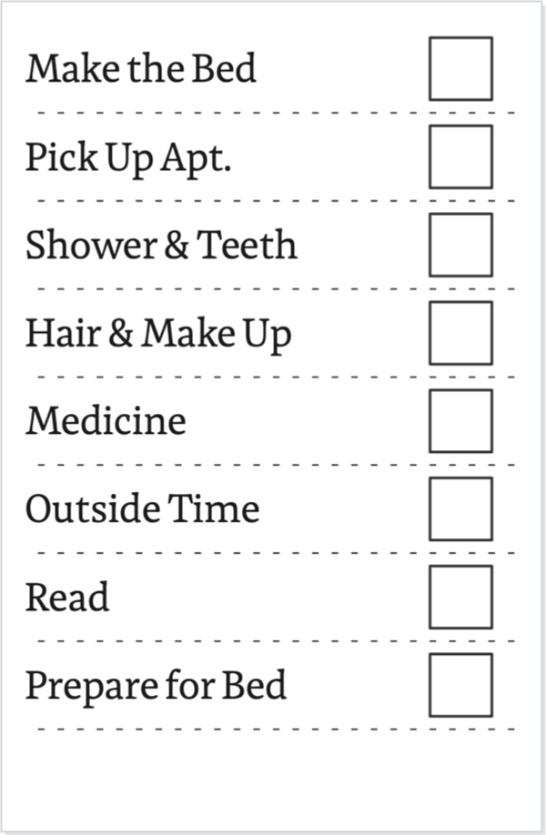
And finally, we see an ingenious and inventive use of widgets to create a vertical check table with right-side checkboxes. Very impressive!
Do you like our widgets? Remember that you can always reach out to us if you have any questions.
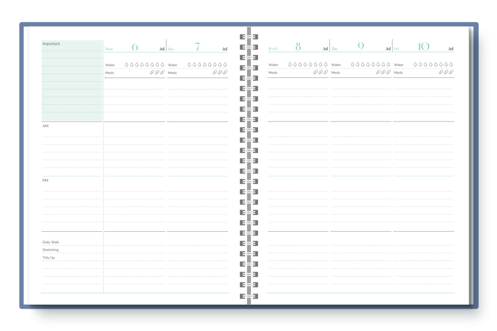
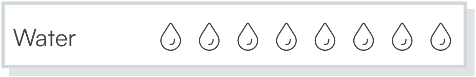
Over the past few years we’ve received many requests for an option to add water drops to pages. We’re happy to tell you that you can now add water drops to your Pro pages.
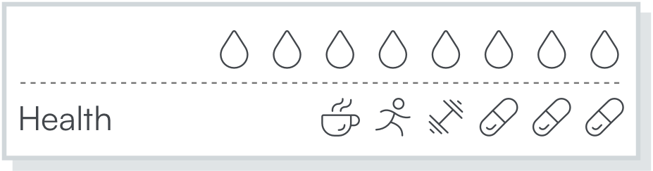
And, since these are Agendio widgets, you can add much much more!
You can add widgets for medications, exercise, quiet time and mood, to name just a few. You can even add widgets for religions.
You can add them on one line or many lines, and choose from a list of more than 30 widget symbols.
You can try widgets out right now: Open one of your pages in the Designer, or start a new one, then add a widget pagelet from the pagelet drawer, the same way you add any other pagelet.
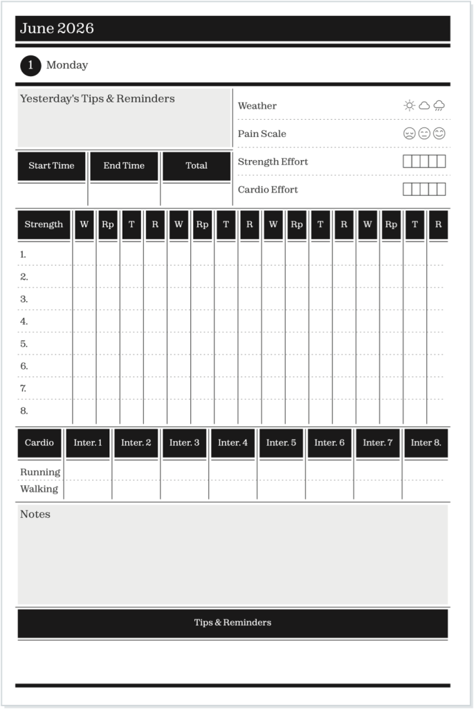
We previously offered full-page tables, even adjustable ones, and we received some great feedback about them. But we have often been asked if one day we can offer pagelet sized ones that use only part of a page. That’s what we’ve just added.
You can add a table to your page the same way you add any other pagelet from the Designer drawer – It’s right next to the tracker pagelet.
And it wouldn’t be an agendio feature if it wasn’t adjustable, so we included three ways for you to adjust the column widths.
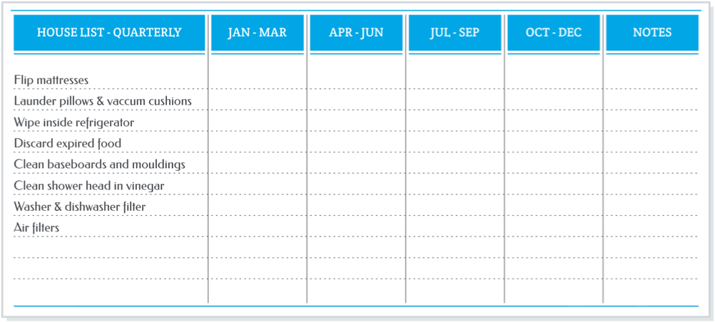
You can use tables to keep track of so many things. Here are some examples:
A table of house jobs you might do every quarter but that we often forget to do. (Custom width selected for column 1, and other columns equal width)
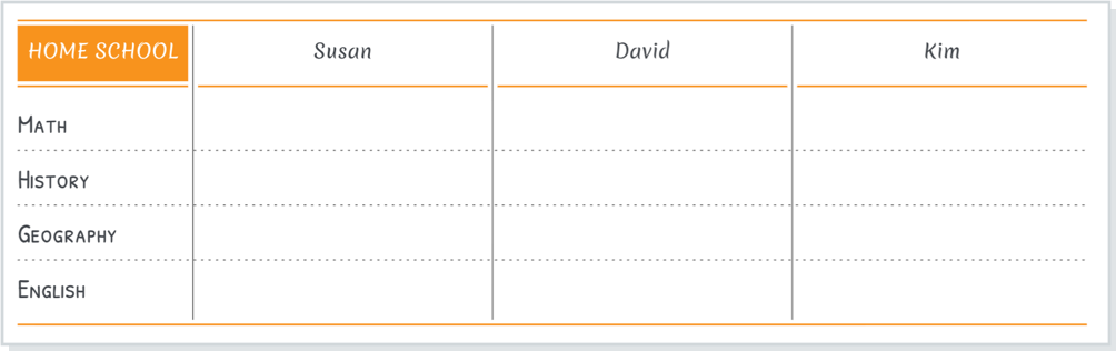
A table for home schooling (Custom width selected for columns 2, 3 and 4 )
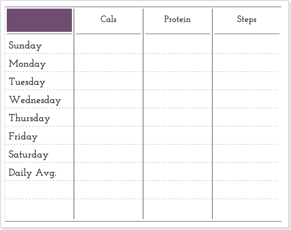
A table for fitness. All columns selected to be of equal width:
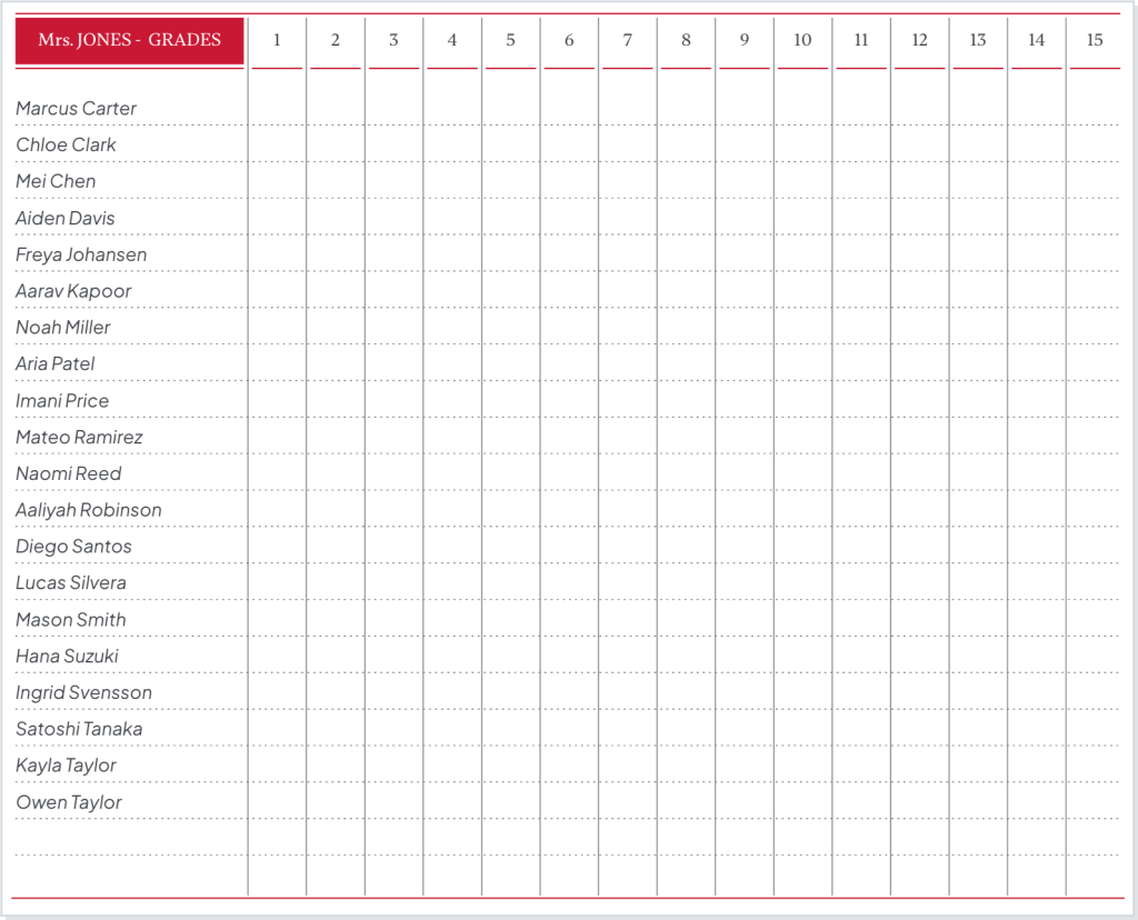
And a special design: A page for teachers to record student grades and test scores.
Now it’s your turn to make a table. What will you use your table for?
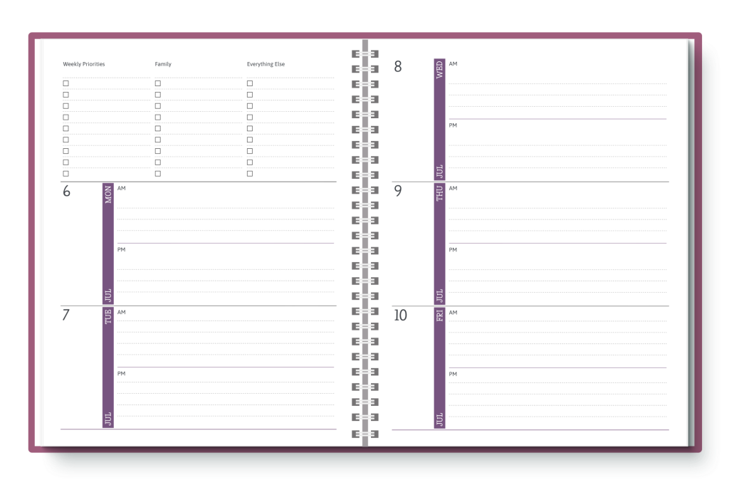
Agendio is the only planner company that offers customizable pagelets to monitor all those things in your life you track a week at a time.
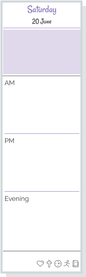
These monitor pagelets have so far all been on the right side of weekly layouts.
Agendio Pro now also offers canvases with monitors on the left. You can select canvases of column planners in large, medium and journal, as well as most inserts with monitors on the left.
Even better, you don’t have to recreate your layout with a new left monitor – you can simply convert your existing Pro pages…
… or just go to the Hub and follow the path to make a new page from a canvas.
Getting to the canvas page is very easy and takes only 3 clicks: Simply select
PAGES – For planners
“Weekly” and your size
“Blank Canvas”
When you land on the canvas selection page, select “Column w/ left monitor” in the filter on the left and you’ll see all the new options.
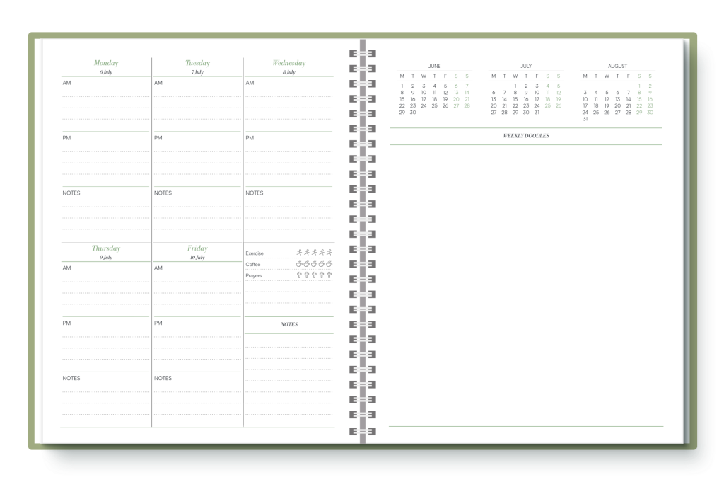
Over the past year we have received an increasing number of requests to add dot backgrounds to pagelets. So we wanted to let you know that we have recently added dots to Agendio Pro as a new option.
You can place the dots in dated pagelets…
… and you can place them in monitors and Extra pages.
When you customize pagelets, you have the option of adding solid lines or dashed lines or even no lines, and now you also have the option of adding a dot pattern to your Pro pagelet.
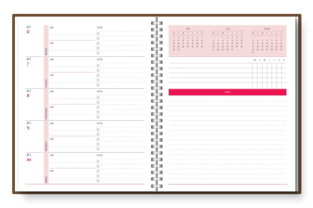
Every month end, when one month crosses over to another month, there is usually one layout that includes pages from both months. We call these “Transition weeks”.
Because they include days from two months, there are many opinions as to where these pages should be placed.
Our Classic builder offers only one way to position these weeks – The transition weeks are always placed with the following month, after any monthly pages.
However, Agendio Pro includes four options for you to place these weeks, so you can choose one that suits your needs exactly. The options include “With the following month”, “With the preceding month”, “Best fit” and “Separate”.
You can find out more about all these options in the Pro guide.
If you are currently using our Classic builder but you don’t want your transition weeks placed with the following month, please consider using our Pro system and take advantage of all the transition week options it offers.
We receive requests every so often for colours of wrap covers we used to offer. We usually have to answer that we don’t have any of the discontinued colours left.
However, we have recently found a few: We have added to our Classic and Pro wrap cover options a small number of red wrap covers in all sizes and turquoise wrap covers in large and medium. If you liked those colours, now is your opportunity to get a turquoise or red Agendio wrap cover.
We have also been asked why our triangle design printed cover is available only in one colour. So we have now also added six new colours to our triangle design printed cover.
You can see all our cover options in the covers section of our website.